CSS3 Animation of Background Colour
There are many websites which are used one solid colour since the flat web design has been a new trend. However, I think some of you got bored of it already. Why don’t you try something new? In this article, I’ll share how to animate background colours using CSS3 animation.
[adA-en]

Themify shows different vivid colours little by little. Our goal is creating this background using CSS3 animation today.
CSS3 Keyframe Animation
First of all, we need to learn CSS3 animation property.
What Is Keyframes?
With the @keyframes rule, you can create animations. The animation is created by gradually changing from one set of CSS styles to another. To use keyframes, you create a @keyframes rule with a name that is then used by the animation-name property to match an animation to its keyframe list.
Keyframes name is defined as @keyframes + keyframe-name. In order for a keyframe list to be valid, it must include rules for at least the times 0% (or from) and 100% (or to). For example, below code shows a animating background colour from red, orange to pink.
@keyframes name {
  0% { background: red; }
  50% { background: orange; }
  100% { background: pink; }
}
You need to add vendor prefix (-webkit-) for Webkit browsers such as Chrome or Safari. So it would be like “@-webkit-keyframes“.
animation Related Properties
animation-name
The animation-name property specifies a name for the @keyframes animation.
animation-duration
This property defines how many seconds or milliseconds an animation takes to complete one cycle. It is defined in seconds (s) or milliseconds (ms). For example, 5 seconds will be written as “5s”.
animation-timing-function
The animation-timing-function specifies the speed curve of the animation.
- ease (Default)
- ease-in
- ease-out
- ease-in-out
- linear
animation-delay
This property defines when the animation will start. It is defined in seconds (s) or milliseconds (ms).
animation-iteration-count
This property defines how many times an animation should be played. infinite specifies that the animation should be played infinite times (for ever).
animation-direction
This property defines whether or not the animation should play in reverse on alternate cycles.
- normal … The animation should be played as normal (Default)
- alternate … The animation will be played as normal every odd time (1,3,5,etc..) and in reverse direction every even time (2,4,6,etc…)
- reverse … The animation should play in reverse direction
- alternate-reverse … Reverse an alternate
animation-play-state
This property specifies whether the animation is running or paused.
animation-fill-mode
This property specifies what styles will apply for the element when the animation is not playing (when it is finished, or when it has a “delay”).
- none (Default)
- forwards … After the animation ends (determined by animation-iteration-count), the animation will apply the property values for the time the animation ended.
- backwards … The animation will apply the property values defined in the keyframe that will start the first iteration of the animation, during the period defined by animation-delay.
- both … The animation will follow the rules for both forwards and backwards.
Shorthand Property
The animation property is a shorthand property for 8 of the animation properties. Always specify the animation-duration property, otherwise the duration is 0, and will never be played.
- animation-name
- animation-duration
- animation-timing-function
- animation-delay
- animation-iteration-count
- animation-direction
- animation-fill-mode
- animation-play-state
/* Example */
body {
  animation: test 5s ease 1s infinite forwards;
}
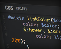
Animating Background Colours
Let’s create animating background colours! I specified a keyframe name as “bg-color”. Don’t forget to write -webkit- version for webkit browsers.
@-webkit-keyframes bg-color {
  0% { background-color: #e74c3c; }
  20% { background-color: #f1c40f; }
  40% { background-color: #1abc9c; }
  60% { background-color: #3498db; }
  80% { background-color: #9b59b6; }
  100% { background-color: #e74c3c; }
}
@keyframes bg-color {
  0% { background-color: #e74c3c; }
  20% { background-color: #f1c40f; }
  40% { background-color: #1abc9c; }
  60% { background-color: #3498db; }
  80% { background-color: #9b59b6; }
  100% { background-color: #e74c3c; }
}
Apply animation to body and value would be bg-color as a keyframe name, 10s which is an animation duration, infinite for loop.
body {
  background-color: #e74c3c;
  animation: bg-color 10s infinite;
  -webkit-animation: bg-color 10s infinite;
}
Check how it works by clicking a “RETURN” button on the right bottom or “Edit on CODEPEN” on the right top.
See the Pen CSS3 Animation – Background colour by Mana (@manabox) on CodePen.
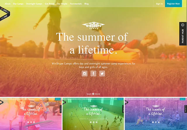
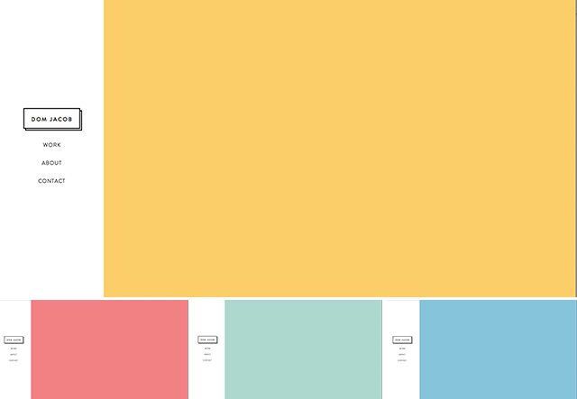
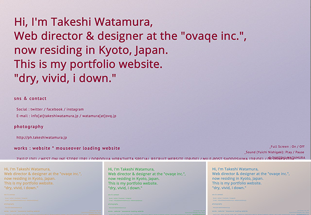
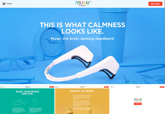
Web Design Gallery
There are some more websites which beautifully animating background colours. Not all of these websites are using CSS3, but you’ll get ideas of colour scheme and design.
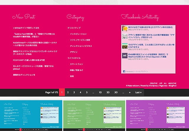
Maka-Veli.com (Footer area)