Creating Accessible Drop-Down Menus
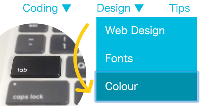
You’ll see a drop-down navigation menu in many websites. It is easy to follow if it’s categorized clearly, and also web designers like to use it because we can save the spaces. However, normal drop-down menus cannot be accessible by tab key. Let’s think about drop-down menus by accessibility perspective.
[adA-en]
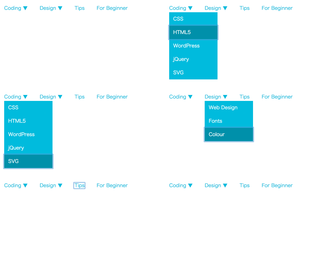
This Gif image shows how to shift link texts by pressing a tab key. Basically, sub menu will not show if it’s added by normal HTML and CSS so our goal is to show it by key board controlling. By the way, have you noticed that you can control a navigation menu by tab key on this website? :)
Create a Normal Drop-Down Menu
When you hover your mouse cursor on a parent menu item, sub menu shows below.
HTML
Adding menus using nested ul. Add “menu-item-has-children” class to the menu which has a sub menu and “sub-menu” class to sub menus. At the same time, add role attribute to nav tag and assign navigation.
<nav role="navigation">
  <ul>
    <li class="menu-item-has-children">
      <a href="#">Coding ▼</a>
      <ul class="sub-menu">
        <li><a href="#">CSS</a></li>
        <li><a href="#">HTML5</a></li>
        <li><a href="#">WordPress</a></li>
        <li><a href="#">jQuery</a></li>
        <li><a href="#">SVG</a></li>
      </ul>
    </li>
    <li class="menu-item-has-children">
      <a href="#">Design ▼</a>
      <ul class="sub-menu">
        <li><a href="#">Web Design</a></li>
        <li><a href="#">Fonts</a></li>
        <li><a href="#">Colour</a></li>
      </ul>
    </li>
    <li><a href="#">Tips</a></li>
    <li><a href="#">For Beginner</a></li>
  </ul>
</nav>
role attribute defines what kind of roles each tag has to improve the accessibility. There are some more roles other than navigation.
- application
- banner
- complementary
- contentinfo
- main
- search
CSS
Make parent menu items floated horizontally by float: left;.
/* Parent nav */
nav > ul > li {
  position: relative;
  float: left;
  margin-right: 45px;
}
nav a {
  color: #0bd;
  text-decoration: none;
}
nav ul a:hover {
  color: #0090aa;
}
Then, place sub menus below parent menus by position: absolute; and hide them by display: none;.
/* .sub-menu */
nav .sub-menu {
  position: absolute;
  width: 180px;
  background: #0bd;
  top: 30px;
  display: none;
}
nav .sub-menu a {
  color: #fff;
  padding: 10px 15px;
  display: block;
}
nav .sub-menu a:hover {
  color: #fff;
}
Finally, show sub menus when parent menu items are hovered by display: block;.
/* Show sub menus by hover */
nav .menu-item-has-children:hover ul {
  display: block;
}
nav li.menu-item-has-children li a:hover {
  background: #0090aa;
}
It works like this below. It’s just a simple drop-down menu.
See the Pen Drop-Down Navigation Menu by Mana (@manabox) on CodePen.
Show Sub Menus When It’s Focused by Tab Key

Even if you focused on parent menu items by tab, sub menus will not show up like above Gif image. So it’s time to use jQuery that we love!
JavaScript
When you focused on parent menu items as .menu-item-has-children a and children menu items as .sub-menu a, .sub-menu will be added a new class name “focused”.
$(function() {
  $('.menu-item-has-children a').focus( function () {
    $(this).siblings('.sub-menu').addClass('focused');
  }).blur(function(){
    $(this).siblings('.sub-menu').removeClass('focused');
  });

// Sub Menu
  $('.sub-menu a').focus( function () {
    $(this).parents('.sub-menu').addClass('focused');
  }).blur(function(){
    $(this).parents('.sub-menu').removeClass('focused');
  });
});
CSS
It’s just the same as style when it’s hovered. Sub menus is showing up by display: block; when it’s focused.
nav .menu-item-has-children:hover ul,
nav .menu-item-has-children ul.focused {
  display: block;
}
nav li.menu-item-has-children li a:hover,
nav li.menu-item-has-children li a:focus {
  background: #0090aa;
}
Finish!
You can control by tab :)
See the Pen Accessible Drop-Down Navigation Menu by Mana (@manabox) on CodePen.
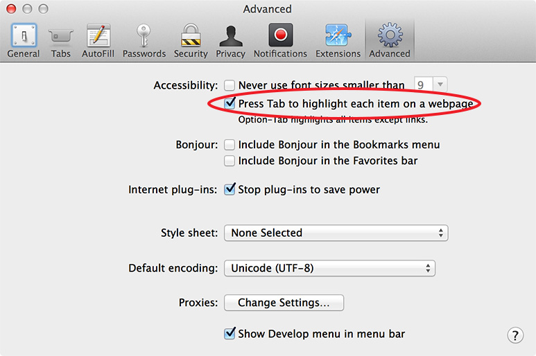
Actually, you cannot shift link texts using tab by default setting on Safari and Firefox on Mac somehow. For Safari, you need to choose Safari > Preferences > Advanced and then select “Press Tab to highlight each item on a webpage”.
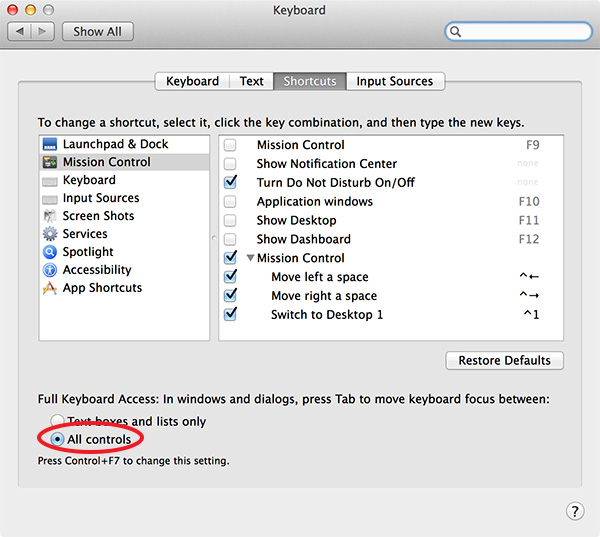
For Firefox, choose System Preferences > Keyboard > Shortcut and then select “All controls” of “Full Keyboard Access” area.
jQuery Plugin: Accessible Mega Menu
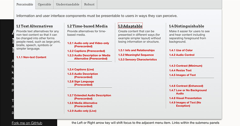
Demo|Download
Accessible Mega Menu is developed by Adobe accessibility team. You can move parent menu items by tab and display sub menus by return. Arrow keys and typing capital letter of menu items are also ready to focus them.
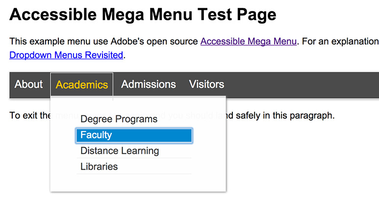
Another demo page shows how easy to select menus by typing capital letter of menu items. Typing “F”, for example, focuses on “Faculty” menu item.
