Useful Sass (SCSS) mixin Snippets
I wrote about Sass (SCSS) on Introduction to Sass and How to Setup with Mac + Codabefore. How are you liking it? Today I will focus on @mixin which is one of the most powerful features of Sass. Some of snippets are included Compass framework but I wrote the code by myself to learn. All of mixins are very easy to customise, so let’s get started to create your own mixins!
[adA-en]
Table of Contents
- What is Sass?
- How to Use @mixin
- Link Colour Setting
- Vendor Prefixing
- Opacity
- Absolute Positioned
- Font Size with rem
- Retina Images
- About Compass
What is Sass?
I will write about an advance techniques of Sass today. If you are new to Sass, I would highly recommend you check out those posts first.
How to Use @mixin
Mixins are defined using the @mixin directive, which takes a block of styles that can then be included in another selector using the @include directive.
SCSS – Define @mixin
@mixin circle {
     width: 50px;
     height: 50px;
     border-radius: 100%;
}
SCSS – Usage with @include
.box {
     @include circle;
     background: #fc0;
}
CSS – Output
.box {
  width: 50px;
  height: 50px;
  border-radius: 100%;
  background: #fc0;
}
Arguments
The real power of mixins comes when you pass them arguments. Arguments are declared as a parenthesized, comma-separated list of variables. Each of those variables is assigned a value each time the mixin is used.
SCSS – Define @mixin
@mixin circle($size) {
     width: $size;
     height: $size;
     border-radius: 100%;
}
SCSS – Usage with @include
.box {
     @include circle(100px);
     background: #fc0;
}
CSS – Output
.box {
  width: 100px;
  height: 100px;
  border-radius: 100%;
  background: #fc0;
}
Default Values
Mixin arguments can also be given default values just like you’d declare them normally. Then the user of the mixin can choose not to pass that argument and it will be assigned the default value.
SCSS – Define @mixin
@mixin circle($size:40px) {
     width: $size;
     height: $size;
     border-radius: 100%;
}
SCSS – Usage with @include
.box {
     @include circle;
     background: #fc0;
}
CSS – Output
.box {
  width: 40px;
  height: 40px;
  border-radius: 100%;
  background: #fc0;
}
OK now you can customise @mixin by yourself!
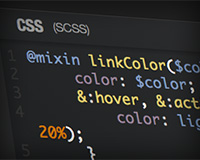
Link Colour Setting
You can set normal link colour as well as :hover, :active, :focus colour at the same time. Once you define normal link colour, Sass generates lighter colour hex code automatically using function of lighten.
There are more functions for the colour. For example, darken to darken the colour, saturate to adjust the saturation etc etc. You’ll see all functions here: Module: Sass::Script::Functions.
SCSS – Define @mixin
@mixin linkColor($color) {
     color: $color;

     &:hover, &:active, &:focus {
         color: lighten($color, 20%);
     }
}
SCSS – Usage with @include
a{
     @include linkColor(#3cf);
}
CSS – Output
a {
  color: #33ccff;
}
a:hover, a:active, a:focus {
  color: #99e6ff;
}
Vendor Prefixing
We still need to add vendor prefix when we use CSS3. It would be really helpful if you define it as @mixin. Please note that I don’t mean you need to add it to all CSS3 properties because there are some CSS3 properties that you don’t have to add vender prefix anymore like border-radius.
SCSS – Define @mixin
@mixin css3($property, $value) {
     @each $prefix in -webkit-, -moz-, -ms-, -o-, '' {
          #{$prefix}#{$property}: $value;
     }
}
SCSS – Usage with @include
.border_radius {
     @include css3(transition, 0.5s);
}
CSS – Output
.border_radius {
  -webkit-transition: 0.5s;
  -moz-transition: 0.5s;
  -ms-transition: 0.5s;
  -o-transition: 0.5s;
  transition: 0.5s;
}
Opacity
It is OK to use opacity property for modern browsers but not for IE. So provide a filter fallback for IE8. You can set opacity from 0 (not visible) to 1 (completely visible) and filter percentage from 0 to 100. It means you can simply multiply the value of opacity by 100 for IE filter.
SCSS – Define @mixin
@mixin opacity($opacity) {
     opacity: $opacity;
     $opacityIE: $opacity * 100;
     filter: alpha(opacity=$opacityIE);
}
SCSS – Usage with @include
.box {
     @include opacity(0.5);
}
CSS – Output
.box {
  opacity: 0.5;
  filter: alpha(opacity=50);
}
Absolute Positioned
Produce all the necessary positioning code to place the target elements by position: absolute;.
SCSS – Define @mixin
@mixin absPosition ($top: auto, $right: auto, $bottom: auto, $left: auto) {
     position: absolute;
     top: $top;
     right: $right;
     bottom: $bottom;
     left: $left;
}
SCSS – Usage with @include
.box {
     @include absPosition(5px, 20px, 10px, 15px);
}
CSS – Output
.box {
  position: absolute;
  top: 5px;
  right: 20px;
  bottom: 10px;
  left: 15px;
}
Font Size with rem
We often use the units of % or em to set font sizes. The rem font size unit is similar to em, only instead of cascading it’s always relative to the HTML element (root). That means that we can define a single font size on the html element and define all rem units to be a percentage of that. Maybe you’ve seen this units because WordPress default theme in 2012, Twenty Twelve is used it.
This has pretty good modern browser support, but it doesn’t support IE 8 and down. We need to provide px fallbacks for.
SCSS – Define @mixin
@mixin fontsize($size: 24, $base: 16) {
  font-size: $size + px;
  font-size: ($size / $base) * 1rem;
}
SCSS – Usage with @include
body {
     @include fontsize(12);
}
CSS – Output
body {
  font-size: 12px;
  font-size: 0.75rem;
}
Retina Images
Using this mixin you can combine media queries and normal CSS image replacement to send high resolution images to retina devices and standard resolution images everywhere else. At first please make a standard resolution image ex: logo.png and a high resolution image ex: logo-2x.png. If it’s a retina display, add -2x after images name and set background-size.
Please note your CSS code might be longer than you expected when it’s complied if you have many retina images. If so, please avoid to use this mixin then code them in the same place.
SCSS – Define @mixin
@mixin imgRetina($image, $extension, $width, $height) {
     background: url($image + '.' + $extension) no-repeat;
     width: $width;
     height: $height;

     @media (min--moz-device-pixel-ratio: 1.3),
           (-o-min-device-pixel-ratio: 2.6/2),
           (-webkit-min-device-pixel-ratio: 1.3),
           (min-device-pixel-ratio: 1.3),
           (min-resolution: 1.3dppx) {
                background-image: url($image + '-2x' + '.' + $extension) no-repeat;
                background-size: $width $height;
     }
}
SCSS – Usage with @include
.logo {
     @include imgRetina(logo, png, 100px, 40px);
}
CSS – Output
.logo {
  background: url(logo.png) no-repeat;
  width: 100px;
  height: 40px;
}
@media (min--moz-device-pixel-ratio: 1.3), (-o-min-device-pixel-ratio: 2.6/2), (-webkit-min-device-pixel-ratio: 1.3), (min-device-pixel-ratio: 1.3), (min-resolution: 1.3dppx) {
  .logo {
    background-image: url(logo-2x.png) no-repeat;
    background-size: 100px 40px;
  }
}
About Compass
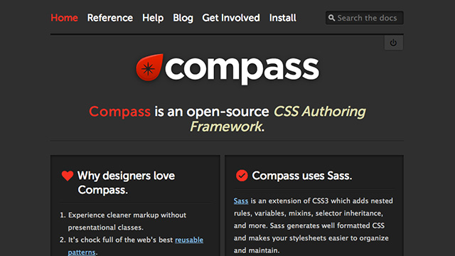
Compass is an open-source CSS authoring framework which uses the Sass stylesheet language to make writing stylesheets powerful and easy.
The easiest way to reset your CSS document is to simply import reset utility like this:
@import 'compass/reset/';
If you want to add box-shadow, include it by @include:
@include box-shadow(#000 2px 2px 5px);
Then it outputs like this. Pretty handy!
-webkit-box-shadow: #000 2px 2px 5px;
-moz-box-shadow: #000 2px 2px 5px;
box-shadow: #000 2px 2px 5px;
These posts introduce about Compass. Please read and try Compass!