Create a Vertical Timeline Using CSS
One of projects that I’m currently working on has a history page and it shows a vertical timeline so I will share that CSS codes. I think everyone can customize it easily because it is not that complicated.
[adA-en]
Demo
It works in Chrome, Firefox, Safari, IE9 and 10.
See the Pen Timeline by Mana (@manabox) on CodePen.
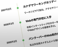
Above image shows a mobile version. It is based on a mobile-first strategy. Please adjust a width of demo page and see how it works.
HTML
Add contents using li tag inside of timeline.
<ul class="timeline">
  <li>
    <p class="timeline-date">Feb 2007</p>
    <div class="timeline-content">
      <h3>Canada</h3>
      <p>I moved to Vancouver, Canada to broaden my horizons.</p>
    </div>
  </li>
</ul>
timeline-date contains date and timeline-content contains contents. You can remove h3 if you don’t need.
CSS
For Mobile
List items with margins if it’s mobile because it looks a bit tight.
.timeline {
  list-style: none;
}
.timeline > li {
  margin-bottom: 60px;
}
Very simple. You can customize as you like.
For Desktop
Responsive
@media ( min-width : 640px ) {

  /* Write CSS for desktop version */

}
Write CSS for 640px or larger display using media-queries. You can adjust the width of course.
Date and Contents
.timeline > li {
  overflow: hidden;
  margin: 0;
  position: relative;
}
.timeline-date {
  width: 110px;
  float: left;
  margin-top: 20px;
}
.timeline-content {
  width: 75%;
  float: left;
  border-left: 3px #e5e5d1 solid;
  padding-left: 30px;
}
Write them inside of @media〜. .timeline-date and .timeline-content should be floated horizontally with float property.
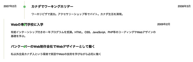
It needs overflow: hidden; to reset float otherwise the layout will be broken like this.
Circle
Circle will be displayed by an empty content with border-radius: 100%; and place with position: absolute; .
.timeline-content:before {
  content: '';
  width: 12px;
  height: 12px;
  background: #6fc173;
  position: absolute;
  left: 106px;
  top: 24px;
  border-radius: 100%;
}